First look at Joy UI 🥳
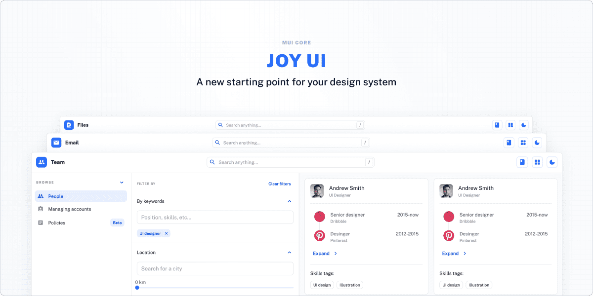
If you're a close follower of everything MUI, you might be aware that we've been working on a new design system. If not, then this post will give you a first look at Joy UI-MUI's new starting point for your design system!
If you've ever considered using Material UI because of the developer experience, reliability, and completeness, but hesitated because of the design, this is great news for you. Joy UI offers all of that, but with a modern look and feel, ease of customization, and lower overhead by not carrying unused Material Design specific code and styling.
How does Joy UI relate to Material UI?
You might naturally associate MUI with Material UI, which despite the similar names, are separate things. Material UI is MUI's React implementation of Google's Material Design.
Over time Material UI has established itself as the go-to library for quickly breathing life into products, mostly thanks to its design, customizability, and documentation. However, the components do come by default with the 2018 Google look and feel that is no longer as popular as it once was. And as we've confirmed with our latest Developer Survey, design quality is one of the most important elements that developers consider when choosing a UI library.
Why not just build a new Material UI theme?
One of the main objectives with this new product is to break away from Material Design. A different theme would still require you and your team to have at least some understanding of how Material Design is structured, and how that is expressed in Material UI. With Joy, you're able to start with a fresh design by default.
We also had many ideas for improving the experience of developing design systems, so a separate package is an opportunity to prototype and test some of these new features without running the risk of compromising the experience of the thousands of teams that use Material UI today.
Material UI and Joy UI still share many of the same conventions and features. We've done this not only to decrease the learning curve for adopting Joy UI, but also because we believe that the conventions we've established represent the ideal developer experience for working with design systems.
What new features does Joy UI offer?
Aside from a fresher look and feel for your upcoming project, here are a few features included in the alpha version of Joy UI:
Global variants
Instead of defining variants at the component level, Joy UI defines them at the global level. This sounds bold at first, but the more we experiment the more it starts to make sense. Global variants mostly affect three CSS properties: color, background, and border.
What this means is that you're able to switch between the same set of variants in any component, more easily maintaining consistency across your app.
The four variants available in the components are solid, soft, outlined, and plain.

<Button variant="solid">
<Button variant="soft">
<Button variant="outlined">
<Button variant="plain">
Automatic adjustment
We meticulously constructed the CSS variables for each component so you can seamlessly compose them with little customization necessary. One good example is the input component, where the border radius of the input's children automatically adapts to that of the input. These small details mean the components adapt to different scenarios, which saves considerable time when customizing the components by avoiding manual adjustments.

When customizing the input's border radius, the icon button inside of it adapts automatically.
<Input
  placeholder="password"
  endDecorator={<IconButton size="sm"><Visibility /></IconButton>}
/>

<Input
  size="lg"
  placeholder="password"
  endDecorator={<IconButton><Visibility /></IconButton>}
  sx={{ '--Input-radius': '24px' }}
/>
Joy UI doesn't sacrifice customization in order to have these automatic adjustments.
You're still able to override the style completely via the usual CSS overrides, or even adjust the predefined CSS variables with the sx prop.
Perfect dark mode, for server-side rendering
Joy UI provides an effective way to prevent UI flicker when users refresh or re-enter a page with dark mode enabled. The out-of-the-box CSS variables support allows every color scheme to be rendered at build time, inserting the selected color scheme and mode before the browser renders the DOM.
What's more, it provides a component called InitColorSchemeScript that enables you to have perfect functioning dark mode in various React frameworks, such as Next.js, Gatsby, and Remix.
// A Next.js example
import Document, { Html, Head, Main, NextScript } from 'next/document';
import InitColorSchemeScript from '@mui/joy/InitColorSchemeScript';

export default class MyDocument extends Document {
  render() {
    return (
      <Html data-color-scheme="light">
        <Head>...</Head>
        <body>
          <InitColorSchemeScript />
          <Main />
          <NextScript />
        </body>
      </Html>
    );
  }
}
Unlimited color schemes
Beyond light and dark mode toggling, Joy UI lets you provide your users with multiple color schemes. Within each mode, you'll be able to have as many color schemes as you want-powered by CSS variables.
When will Joy UI be ready to use?
A significant part of the core infrastructure for Joy UI has already been developed, and we've been working for the last couple of months on adding more components. The package is already available from npm but until we get to a reasonable number of components, and with sufficient documentation, it remains an initial work in progress.
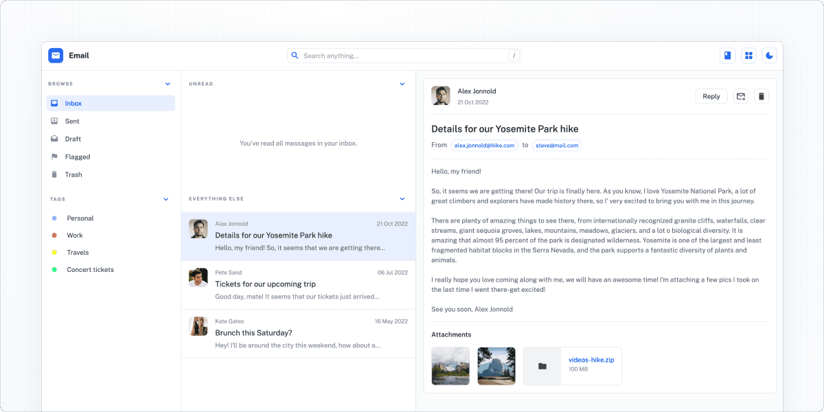
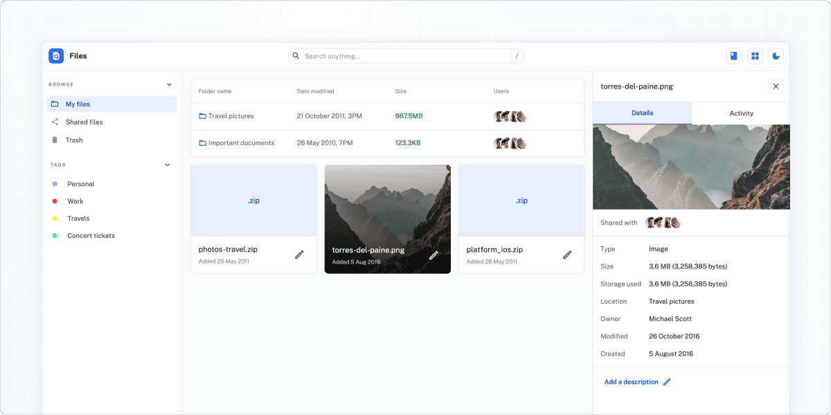
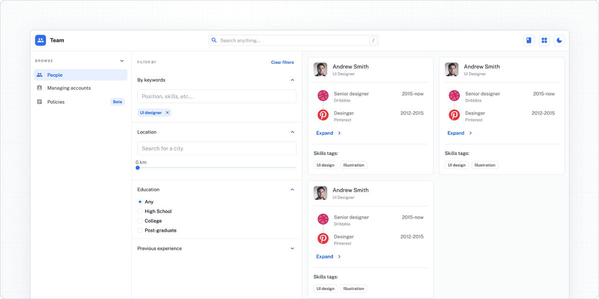
It should be ready for more mature experimentation and testing in the second half of 2022. Meanwhile, we've developed a couple of templates that showcase what Joy UI looks like out of the box, so you can explore it further. Follow the templates' CodeSandbox or live demo links to experiment with Joy UI for yourself.
File management
Team management
Joy UI is just getting started and we hope you're as excited as we are-stay tuned for more news in the near future!
Happy developing! 👩💻


